Hello Guys, welcome back to another blog from The Coding Hubs. Today in this tutorial, we will Build a Responsive Personal Portfolio Website Using HTML CSS and JavaScript.
I’ll show you how to Build a Responsive Personal Portfolio Website Using HTML CSS and JavaScript. I will provide you with the starting files. We will go part by part. The first part we will create is this header, followed by the Hero Section, About Section, Skills Section, Portfolio Section, experience sections, and so on.
I am a Programmer and Content creator, writing programs and blogs since 2015, and I know how to Build a Responsive Personal Portfolio Website Using HTML CSS and JavaScript easily and step by step.
Introduction
You may think? What is Build a Responsive Personal Portfolio Website Using HTML CSS and JavaScript? A responsive personal portfolio website responsive to multiple devices like desktops, laptops, and mobile phones. A portfolio can showcase your work, skills, and experiences and can be a great way to show your personality. You can use a portfolio website when applying for jobs or internships.
Steps to Build a Responsive Personal Portfolio Website Using HTML CSS and JavaScript
To make a Build a Responsive Personal Portfolio Website Using HTML CSS and JavaScript. Make a new folder and give your project whatever name you like. I have given a web developer portfolio. Then, make three files inside this folder. Give the file names accordingly: index.html, style.css, and script.js.
After creating these files, copy and paste the provided codes into the respective files. If you would instead do this, scroll down and click the provided download button to get the Responsive Personal Portfolio Website Using HTML CSS and JavaScript source code file.
Code to Build a Responsive Personal Portfolio Website Using HTML CSS and JavaScript.
Step 1: Write HTML Code to Build a Responsive Personal Portfolio Website Using HTML CSS and JavaScript
Start by launching your index.html file and adding the code below.
<!DOCTYPE html>
<html lang="en">
<head>
    <meta charset="UTF-8">
    <meta name="viewport" content="width=device-width, initial-scale=1.0">
    <title>Portfolio</title>
    <link href="https://cdn.jsdelivr.net/npm/tailwindcss@2.2.19/dist/tailwind.min.css" rel="stylesheet">
</head>
<body class="bg-gray-100 text-gray-900">
    <!-- Header -->
    <header class="bg-white shadow-md py-4">
        <div class="container mx-auto px-6 flex justify-between items-center">
            <div class="text-2xl font-bold">[Your Name]</div>
            <nav class="hidden md:flex space-x-6">
                <a href="#home" class="hover:text-indigo-600">Home</a>
                <a href="#about" class="hover:text-indigo-600">About</a>
                <a href="#projects" class="hover:text-indigo-600">Projects</a>
                <a href="#skills" class="hover:text-indigo-600">Skills</a>
                <a href="#contact" class="hover:text-indigo-600">Contact</a>
                <a href="#hire-me" class="bg-indigo-600 text-white py-2 px-4 rounded hover:bg-indigo-700">Hire Me</a>
            </nav>
            <div class="md:hidden">
                <button id="menu-btn" class="text-gray-900 focus:outline-none">
                    <svg class="h-6 w-6" fill="none" stroke="currentColor" viewBox="0 0 24 24" xmlns="http://www.w3.org/2000/svg">
                        <path stroke-linecap="round" stroke-linejoin="round" stroke-width="2" d="M4 6h16M4 12h16m-7 6h7"></path>
                    </svg>
                </button>
            </div>
        </div>
    </header>

    <!-- Mobile Menu -->
    <div id="mobile-menu" class="hidden md:hidden">
        <nav class="px-6 py-4">
            <a href="#home" class="block py-2">Home</a>
            <a href="#about" class="block py-2">About</a>
            <a href="#projects" class="block py-2">Projects</a>
            <a href="#skills" class="block py-2">Skills</a>
            <a href="#contact" class="block py-2">Contact</a>
            <a href="#hire-me" class="block py-2 bg-indigo-600 text-white rounded">Hire Me</a>
        </nav>
    </div>

    <!-- Hero Section -->
    <section class="container mx-auto px-6 py-12 flex flex-col md:flex-row items-center">
        <div class="w-full md:w-2/3 mb-6 md:mb-0">
            <img src="profile 1.jpg" alt="Web Developer Image" class="w-full md:w-2/3 h-2/3 rounded-lg shadow-lg">
        </div>
        <div class="w-full md:w-1/2 mt-6 md:mt-0 md:ml-6">
            <h1 class="text-4xl font-bold">Hi, I'm [Your Name], a Web Developer.</h1>
            <p class="mt-4 text-lg">Welcome! I'm a seasoned web developer dedicated to crafting engaging online experiences. With a passion for clean, efficient code and a keen eye for design, I specialize in bringing ideas to life through responsive and dynamic websites. </p>
            <a href="#contact" class="mt-6 inline-block bg-indigo-600 text-white py-2 px-4 rounded hover:bg-indigo-700">Contact Me</a>
        </div>
    </section>


    <!-- About Section -->
    <section class="bg-white py-12">
        <div class="container mx-auto px-6">
            <h2 id="about" class="text-3xl font-bold text-center">About Me</h2>
            <p class="mt-4 text-lg text-center">Greetings! I'm [Your Name], a web developer with [X] years of hands-on experience in the ever-evolving realm of web technologies. From HTML and CSS to JavaScript frameworks like React and Vue.js, I've honed my skills to deliver pixel-perfect designs coupled with seamless functionality. My journey began with a passion for problem-solving, which has led me to work on diverse projects ranging from e-commerce platforms to corporate websites. With a commitment to staying updated on the latest trends and technologies, I strive to create user-centric experiences that leave a lasting impression. Let's collaborate to transform your digital aspirations into reality!</p>
        </div>
    </section>

        <!-- Skills Section -->
        <section class="bg-gray-100 py-12">
            <div class="container mx-auto px-6">
                <h2 id="skills" class="text-3xl font-bold text-center">Technical Skills</h2>
                <div class="flex flex-wrap justify-center mt-6">
                    <div class="w-1/2 md:w-1/4 lg:w-1/6 p-4">
                        <img src="HTML.png" alt="HTML" class="mx-auto h-16">
                        <p class="mt-2 text-center">HTML</p>
                    </div>
                    <div class="w-1/2 md:w-1/4 lg:w-1/6 p-4">
                        <img src="CSS.png"CSS" class="mx-auto h-16">
                        <p class="mt-2 text-center">CSS</p>
                    </div>
                    <div class="w-1/2 md:w-1/4 lg:w-1/6 p-4">
                        <img src="JS.png" alt="JavaScript" class="mx-auto h-16">
                        <p class="mt-2 text-center">JavaScript</p>
                    </div>
                    <div class="w-1/2 md:w-1/4 lg:w-1/6 p-4">
                        <img src="React.png" alt="React" class="mx-auto h-16">
                        <p class="mt-2 text-center">React</p>
                    </div>
                    <!-- Add more skill icons as needed -->
                </div>
                <div class="flex justify-center mt-8 space-x-4">
                    <a href="[GitHub-link]" class="text-indigo-600 hover:text-indigo-800">GitHub</a>
                    <a href="[LinkedIn-link]" class="text-indigo-600 hover:text-indigo-800">LinkedIn</a>
                    <!-- Add more links as needed -->
                </div>
            </div>
        </section>


            <!-- Portfolio Section -->
    <section class="bg-white py-12">
        <div class="container mx-auto px-6">
            <h2 id="portfolio" class="text-3xl font-bold text-center">Portfolio</h2>
            <div class="flex flex-wrap justify-center mt-6">
                <div class="w-full md:w-1/2 lg:w-1/3 p-4">
                    <div class="bg-gray-100 rounded-lg shadow-lg p-4">
                        <img src="Online-Ticket-Booking-Website-Project-1024x576.webp" alt="Project 1" class="w-full h-auto rounded">
                        <h3 class="text-xl font-bold mt-4">Online Ticket Booking Website Project</h3>
                        <p class="mt-2">An Online Ticket Booking Website Project is a website that allows potential guests to self-book and pay through your website.</p>
                        <div class="flex justify-between mt-4">
                            <a href="[live-demo-link-1]" class="text-indigo-600 hover:text-indigo-800">Live Demo</a>
                            <a href="[github-link-1]" class="text-indigo-600 hover:text-indigo-800">GitHub</a>
                        </div>
                    </div>
                </div>
                <div class="w-full md:w-1/2 lg:w-1/3 p-4">
                    <div class="bg-gray-100 rounded-lg shadow-lg p-4">
                        <img src="Hostel-Management-System-Project-output-1024x576.webp" alt="Project 2" class="w-full h-auto rounded">
                        <h3 class="text-xl font-bold mt-4">Hostel Management System Project</h3>
                        <p class="mt-2">The use of the Hostel Management System Project is to manage a hostel and avoid the problems that occur when carried out manually.</p>
                        <div class="flex justify-between mt-4">
                            <a href="[live-demo-link-2]" class="text-indigo-600 hover:text-indigo-800">Live Demo</a>
                            <a href="[github-link-2]" class="text-indigo-600 hover:text-indigo-800">GitHub</a>
                        </div>
                    </div>
                </div>
                <div class="w-full md:w-1/2 lg:w-1/3 p-4">
                    <div class="bg-gray-100 rounded-lg shadow-lg p-4">
                        <img src="Online-Ticket-Booking-Website-Project-1024x576.webp" alt="Project 1" class="w-full h-auto rounded">
                        <h3 class="text-xl font-bold mt-4">Online Ticket Booking Website Project</h3>
                        <p class="mt-2">An Online Ticket Booking Website Project is a website that allows potential guests to self-book and pay through your website.</p>
                        <div class="flex justify-between mt-4">
                            <a href="[live-demo-link-1]" class="text-indigo-600 hover:text-indigo-800">Live Demo</a>
                            <a href="[github-link-1]" class="text-indigo-600 hover:text-indigo-800">GitHub</a>
                        </div>
                    </div>
                </div>
                <div class="w-full md:w-1/2 lg:w-1/3 p-4">
                    <div class="bg-gray-100 rounded-lg shadow-lg p-4">
                        <img src="Hostel-Management-System-Project-output-1024x576.webp" alt="Project 2" class="w-full h-auto rounded">
                        <h3 class="text-xl font-bold mt-4">Hostel Management System Project</h3>
                        <p class="mt-2">The use of the Hostel Management System Project is to manage a hostel and avoid the problems that occur when carried out manually.</p>
                        <div class="flex justify-between mt-4">
                            <a href="[live-demo-link-2]" class="text-indigo-600 hover:text-indigo-800">Live Demo</a>
                            <a href="[github-link-2]" class="text-indigo-600 hover:text-indigo-800">GitHub</a>
                        </div>
                    </div>
                </div>
                <!-- Add more projects as needed -->
            </div>
        </div>
    </section>


    <section class="bg-gray-100 py-12">
        <div class="container mx-auto px-6">
            <h2 id="experience" class="text-3xl font-bold text-center mb-6">Work Experience</h2>
            <div class="flex flex-col space-y-6">
                <div class="bg-white shadow-md p-6 rounded-lg">
                    <h3 class="text-xl font-bold mb-2">Web Developer</h3>
                    <p class="text-gray-600 mb-2">ABC Company</p>
                    <p class="text-gray-600 mb-2">January 2020 - Present</p>
                    <ul class="list-disc ml-6">
                        <li>Developed and maintained multiple websites using HTML, CSS, and JavaScript.</li>
                        <li>Implemented responsive design principles to ensure cross-device compatibility.</li>
                        <li>Collaborated with designers to implement UI/UX enhancements.</li>
                        <!-- Add more achievements or projects completed -->
                    </ul>
                </div>
                <div class="bg-white shadow-md p-6 rounded-lg">
                    <h3 class="text-xl font-bold mb-2">Frontend Developer</h3>
                    <p class="text-gray-600 mb-2">XYZ Corporation</p>
                    <p class="text-gray-600 mb-2">June 2018 - December 2019</p>
                    <ul class="list-disc ml-6">
                        <li>Designed and developed user interfaces for web applications using React.</li>
                        <li>Integrated APIs to fetch and display dynamic content.</li>
                        <li>Optimized website performance and accessibility.</li>
                        <!-- Add more achievements or projects completed -->
                    </ul>
                </div>
                <!-- Add more work experience sections as needed -->
            </div>
        </div>
    </section>

    <section class="bg-gray-100 py-12">
        <div class="container mx-auto px-6">
            <h2 class="text-3xl font-bold text-center mb-6">Contact</h2>
            <div class="grid grid-cols-1 md:grid-cols-2 gap-6">
                <div class="bg-white shadow-md p-6 rounded-lg">
                    <h3 class="text-xl font-bold mb-4">Contact Information</h3>
                    <p><strong>Email:</strong> example@example.com</p>
                    <p><strong>Phone:</strong> +1234567890</p>
                    <p><strong>Address:</strong> 123 Web Developer St, City, Country</p>
                </div>
                <div class="bg-white shadow-md p-6 rounded-lg">
                    <h3 class="text-xl font-bold mb-4">Contact Form</h3>
                    <form action="#" method="POST">
                        <div class="mb-4">
                            <label for="name" class="block text-sm font-medium text-gray-700">Name</label>
                            <input type="text" name="name" id="name" class="mt-1 p-2 border border-gray-300 rounded-md w-full">
                        </div>
                        <div class="mb-4">
                            <label for="email" class="block text-sm font-medium text-gray-700">Email</label>
                            <input type="email" name="email" id="email" class="mt-1 p-2 border border-gray-300 rounded-md w-full">
                        </div>
                        <div class="mb-4">
                            <label for="message" class="block text-sm font-medium text-gray-700">Message</label>
                            <textarea name="message" id="message" rows="4" class="mt-1 p-2 border border-gray-300 rounded-md w-full"></textarea>
                        </div>
                        <button type="submit" class="bg-blue-500 text-white py-2 px-4 rounded-md hover:bg-blue-600">Send Message</button>
                    </form>
                </div>
            </div>
        </div>
    </section>


    <!-- Social Media Links -->
    <footer class="bg-gray-800 text-white py-4">
        <div class="container mx-auto px-6 flex justify-center space-x-6">
            <a href="[social-link-1]" class="hover:text-indigo-400">[Social 1]</a>
            <a href="[social-link-2]" class="hover:text-indigo-400">[Social 2]</a>
            <a href="[social-link-3]" class="hover:text-indigo-400">[Social 3]</a>
        </div>
    </footer>
</body>
</html>
Step 2: Write CSS Code to Build a Responsive Personal Portfolio Website Using HTML CSS and JavaScript
The second step is to open your style.css file and add the following code. (not necessary)
// Style us you want
Step 3: Write JavaScript Code to Build a Responsive Personal Portfolio Website Using HTML CSS and JavaScript
Third, open the script.js file in your file and insert the script below.
<script>
        const menuBtn = document.getElementById('menu-btn');
        const mobileMenu = document.getElementById('mobile-menu');

        menuBtn.addEventListener('click', () => {
            mobileMenu.classList.toggle('hidden');
        });
</script>
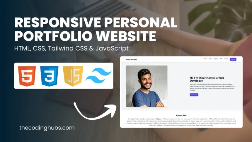
The Output of Build a Responsive Personal Portfolio Website Using HTML CSS and JavaScript
Clicking the download option will allow you to get the source code files for this Build a Responsive Personal Portfolio Website Using HTML CSS and JavaScript at no cost. This will be helpful if you are having trouble making your code or if it isn’t functioning as it should.